Spark banking

UX/UI design • Research • Usability testing • Design system
Project Overview
The learning project is part of a Google's UX Design specialization course on Coursera. Spark bank specializes in working with individuals and small businesses. They want to establish a mobile app for current customers to conduct daily banking activity and to draw in new customers with a lucrative cash-back program.
Project's goal
Create an MVP of exceptional service that enables customers to conduct daily banking at any time and location and includes strong support and a customizable cash-back scheme.
The problem
One of the potential problems in this project could be the lack of a user-friendly and efficient mobile app for conducting daily banking activities. The existing platform may not meet the needs and expectations of the customers, resulting in a less-than-ideal user experience.

Additionally, the absence of a customizable cash-back scheme may limit the bank's ability to attract and retain customers, as they may prefer alternative options with better rewards programs.
Role and responsibilities
As a UX/UI designer, my responsibilities included conducting user research to understand the needs and preferences of customers. I translated those insights into intuitive and visually appealing designs, creating wireframes, prototypes, and user flows. I also conducted usability testing and gathered feedback from users to iterate and improve the user experience. Throughout the project, I focused on creating a seamless and engaging mobile app interface that met the needs of both current and potential customers.
Design approach
The “design thinking” process, defined by the Stanford School of Design, includes five stages: empathize, define, ideate, prototype, and test. Hasso Plattner Institute of Design
I've done five remote interviews with users of the most popular bank apps for iOS and Android as part of my primary qualitative study.
This made it easier to identify the most crucial and frequently utilised software features, as well as the problems and problems users face.
Interviews
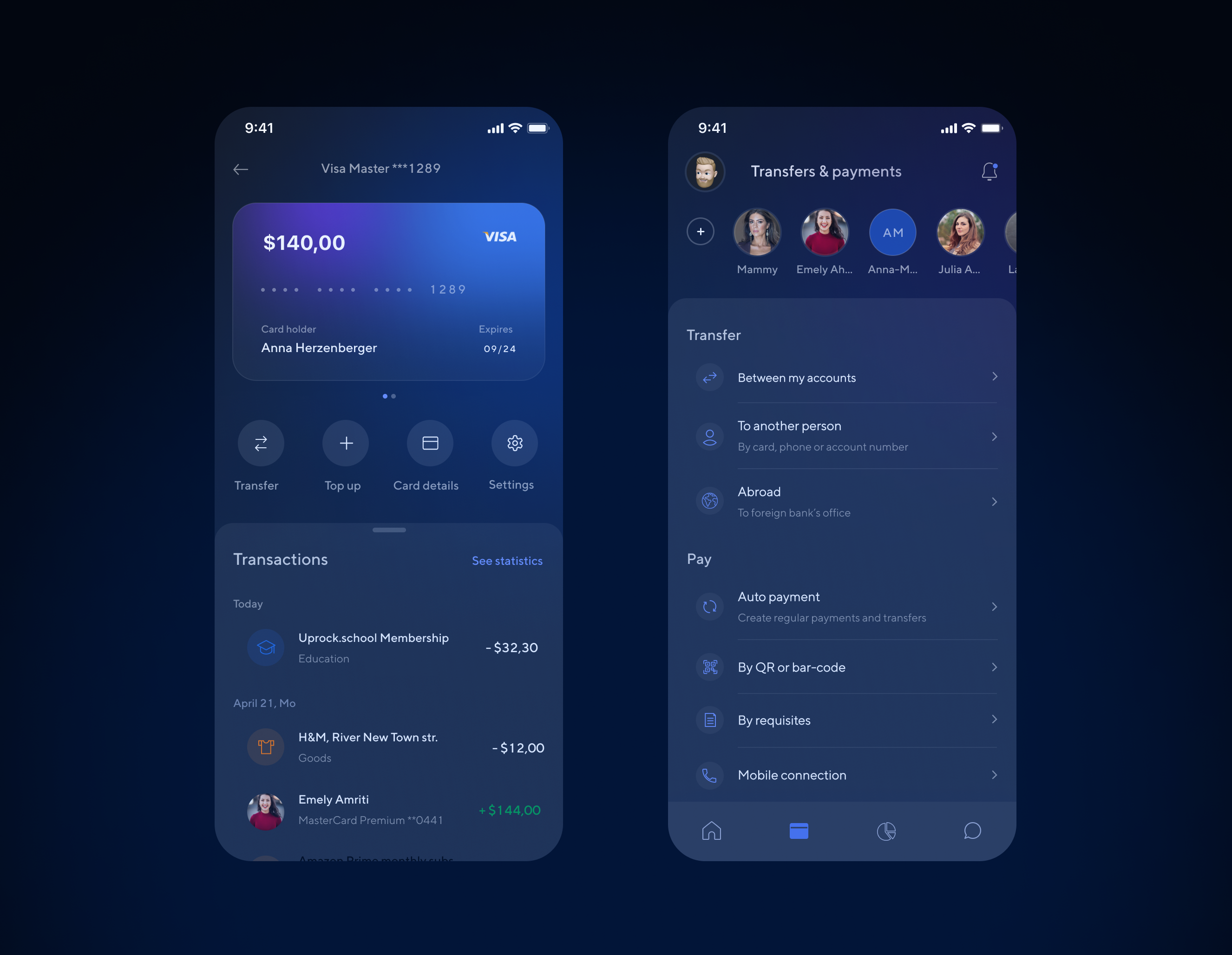
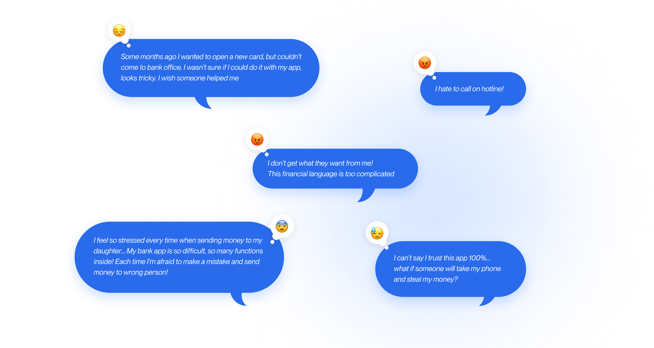
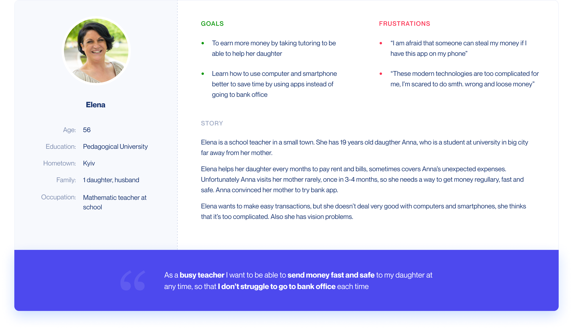
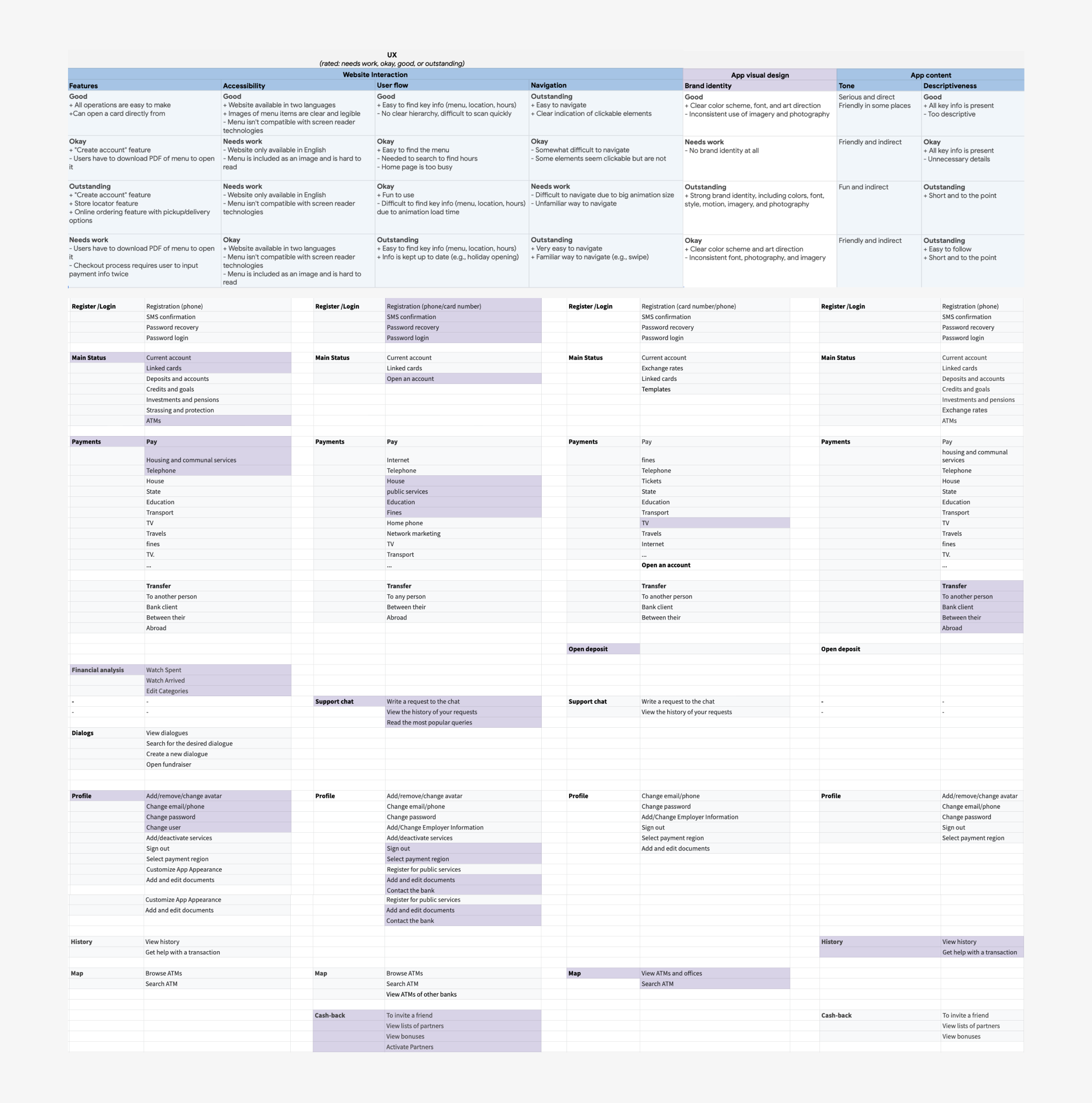
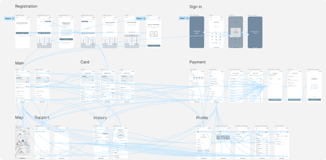
I discovered through interviews that users experience tension because they wish to protect their money. They require basic language, transparent and uncomplicated processes, and frequently rapid assistance.

I made the decision to offer a trustable, user-friendly daily banking service with attentive customer service. It's crucial to communicate with the user in his language and steer clear of complicated financial jargon.

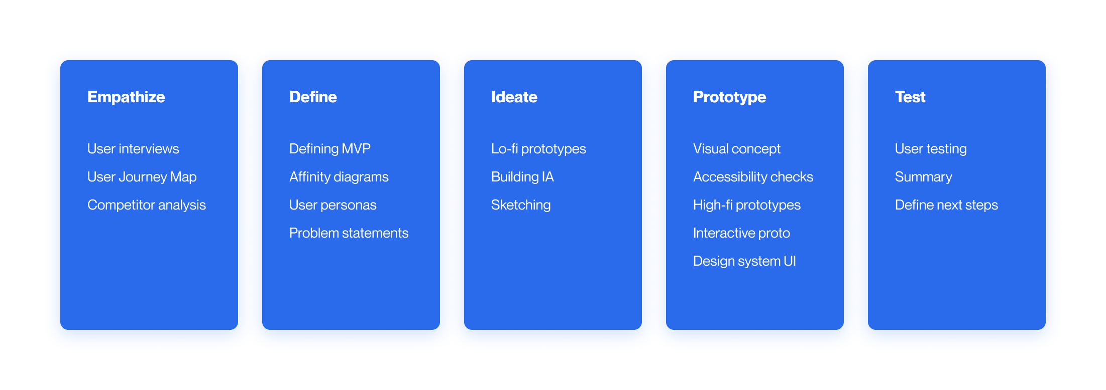
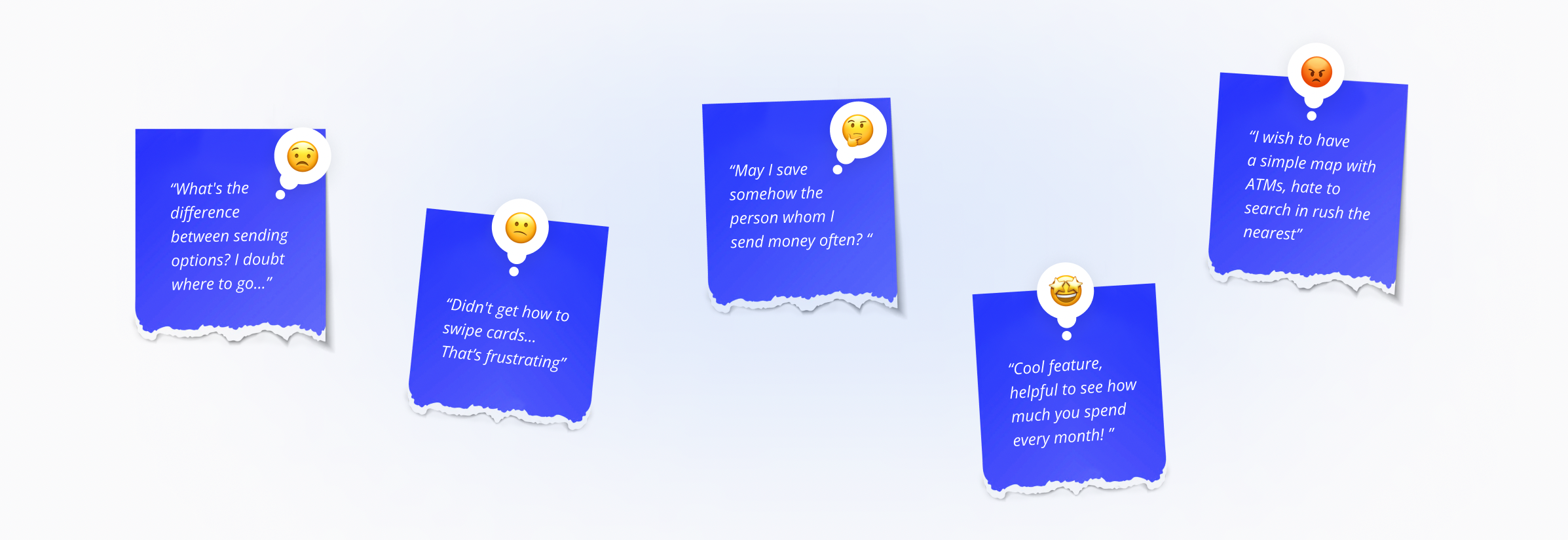
Top 5 pain points from my research:

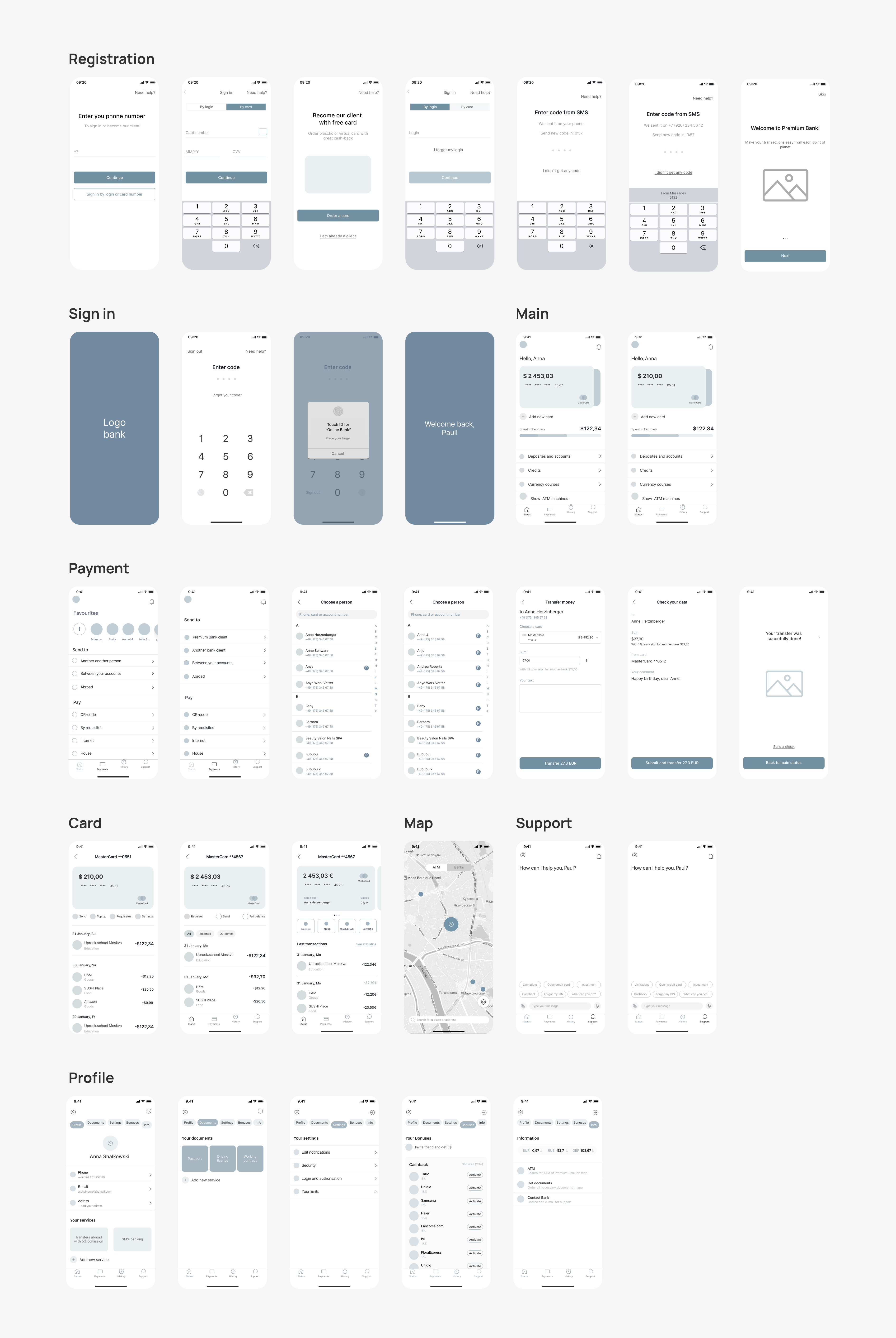
1. Users need to make fast and safe transactions.
Usually, apps are overloaded, and steps are unclear, making users doubt if they will make it all right and won’t lose money.

2. Users are scared that scammers can access their bank accounts and
steal their money. Or that users make transactions wrong themselves.

3. Financial language is quite complex for most users.
Customers need clarification on the financial jargon and operations.

4. Users need help now and here.
They have a lot of questions, which need to be solved immediately,
but reaching the hotline or bank manager can be tricky.

5. Users can’t save money.
It isn’t easy to control all incomes/outcomes, analyze finances, and save money.
Pain points
The market analysis showed that most of the products cover planning and organizing processes and notifying about upcoming events. However, only one of them (Pomodoro) assisted with time management. Also, mental support remained outside of the focus of all those tools.
User personas
Customer journey map
Following the customer interviews, I synthesized my findings and was able to create customer journey maps for each persona.
I have selected the four most popular mobile banking apps and compared their functionality, interaction, accessibility, aesthetic design, and brand identity based on interviews and surveys. Also I did a functional analysis of those apps.
Competitor research
Based on competitors’ functional analysis, business goals, and user needs, I created the MVP application’s structure, which has limited features. The application should be improved and supplemented after users’ feedback.
Information architecture
I digitalized the original paper wireframes and created a clickable prototype for the initial user test. Some of the user flow wireframes utilized in the experiment are highlighted below.
Low fidelity wireframes
With the set of digital wireframes finished, I created a clickable prototype.
The primary user flow I identified was sending money to a contact to use the prototype for a usability study.
Prototype
For my user testing session, I've used usertesting.com. My goal was to determine users' difficulties when completing core tasks: entering the app, making a transaction with another person, checking the balance, and viewing payment history.

My participant's settings were next: anyone who uses bank apps on their phones;
Operating system: iOS or Android; Age: from 18 till 65; Gender: any; Different abilities include: One user with a visual impairment, One user who isn’t fluent in English;

After the testing sessions I've made a lot of changes in the designs.
User testing
Then, I chose more appropriate ones and transformed them into mid-fidelity wireframes. I iterated on grayscale wireframes after each usability testing round until the flow became clear and understandable for users.
Medium fidelity wireframes
Low contrast can cause a lot of problems with reading. To avoid this, I checked text and icons on different backgrounds for both light and dark modes and found and fixed design issues with insufficient contrast.
Contrast check
Working on this project was an amazing experience. In the early phases, I experimented with a wide range of possibilities. I ended up "restarting" my project more than a few times with several iterations of my design file to ensure that every component of the app was purposefully created. Next time I would try doing more deep user research, as I feel that I could do more in that direction and avoid overiterating. Also I would create different testing scenarios, as not all the flows were tested during the usability tests. I'm satisfied with this project but there is a huge field of improvements exist and can be implemented the next iterations.
Conclusion